
Your website’s design philosophy decides whether visitors stay, scroll, or leave within seconds. With mobile devices now driving the majority of global web traffic, the choice between mobile first and responsive web design has become a business decision, not just a design preference. Both approaches build sites that adapt across screens, yet they begin from opposite ends and produce different outcomes in speed, SEO visibility, and conversion. This blog breaks down how each method works, where they differ, and which one fits your goals. By the end, you will know which approach deserves your investment.
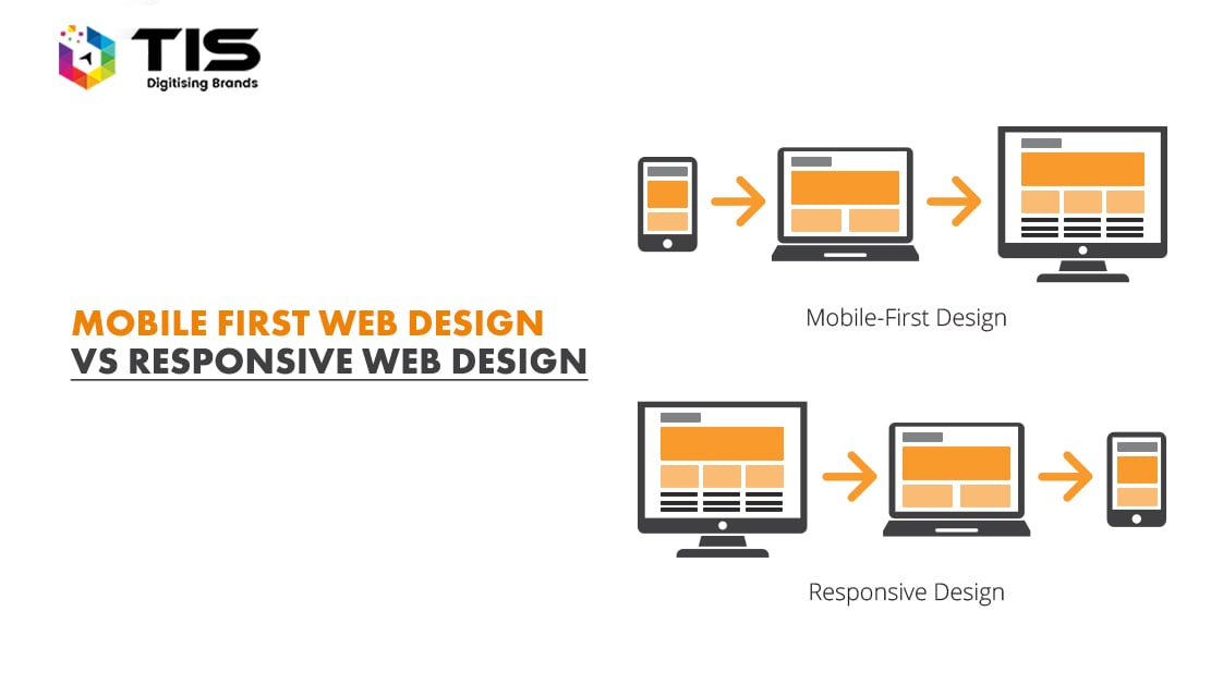
Responsive web design uses a single codebase where layouts flex to fit any screen size through fluid grids, flexible images, and CSS media queries. The design usually starts at the desktop view and scales down. Content rearranges, images resize, and navigation collapses as the viewport shrinks. This makes responsive design efficient for teams that already have a desktop layout and need it to work on phones and tablets without rebuilding from scratch.
The strength of responsive design lies in consistency. Users see the same content, the same brand, and the same structure regardless of device. The trade-off is that mobile users often inherit assets sized for desktop, which can slow loading times and crowd small screens. When done well, responsive design balances reach and effort. When done lazily, it produces shrunken desktop sites that frustrate phone users and bleed engagement.
Mobile first design reverses the order. Designers start with the smallest screen, define what is essential, and progressively enhance the layout for tablets and desktops. Every element on the mobile view must earn its place. Larger screens then add complexity rather than strip it away.
This approach matches how most users actually browse today. Pages load lighter because mobile assets are the default rather than an afterthought. Touch targets, thumb zones, and gesture flows are designed first, not retrofitted. Mobile first is also closer to how Google sees the web. According to Google Search Central guidance on mobile-first indexing, the search engine uses the mobile version of a site as its primary reference for indexing and ranking. A mobile first build feeds Google its best work first. The trade-off is planning effort. Mobile first demands sharper content prioritization and tighter design discipline before a single desktop pixel is drawn.
The labels sound similar, but the operational impact is very different. The table below maps the practical contrasts that matter to product, marketing, and engineering teams.
| Dimension | Mobile First Design | Responsive Web Design |
|---|---|---|
| Starting point | Smallest screen, scale up | Desktop layout, scale down |
| Content priority | Essentials first, extras added | Full content adapted to fit |
| Performance on mobile | Typically faster, leaner assets | Can be heavier if not optimized |
| SEO alignment | Strong fit with mobile-first indexing | Depends on mobile output quality |
| Design effort | Higher upfront planning | Faster to retrofit existing sites |
| Best fit | New builds, mobile-heavy audiences | Established desktop sites, B2B platforms |
| Conversion focus | Optimized for thumb-driven journeys | Balanced across devices |
Google now treats mobile rendering as the primary version of every site. A responsive build that loads heavy desktop assets on mobile can lose ground on Core Web Vitals, mobile usability, and page speed signals. Industry tracking from Statista on the share of global web traffic from mobile devices shows that mobile continues to dominate access patterns worldwide, with India crossing 80 percent mobile share and Africa above 70 percent. Designing for the dominant device is no longer optional.
AI search engines such as ChatGPT, Gemini, and Perplexity reward pages that load quickly and present content in clean, parseable structures. Mobile first sites tend to use cleaner HTML, fewer redundant scripts, and clearer content hierarchies. These traits also help with answer engine optimization, where large language models extract concise blocks of text to cite in their responses. Responsive sites can still rank well, but only when their mobile rendering is treated as a first-class output. Hidden content, slow hero images, and intrusive interstitials on mobile pull rankings down regardless of how polished the desktop view looks.
There is also a structural advantage worth noting. Mobile first builds usually adopt a single column flow as the default, which maps cleanly to how AI overviews and zero-click answer boxes lift content. When a paragraph or list reads well on a small viewport, it almost always reads well as an LLM citation block. Teams that ignore mobile structure often produce content that ranks in classic blue links but never gets picked up by generative search results. The bias of modern search, both Google and AI engines, points in the same direction: prioritise the mobile experience and the rest follows.
Mobile web sessions consistently show higher bounce rates than desktop sessions, reflecting how quickly users abandon a slow or cluttered phone experience. A mobile first build typically loads fewer kilobytes, uses smaller image variants, and avoids JavaScript libraries that the mobile view does not need. The result is faster paint times and lower abandonment.
For conversion, the picture is nuanced. Many users research on mobile and complete purchases on desktop, especially in B2B and high-ticket categories. A responsive site that mirrors content across devices supports this dual journey naturally. A mobile first site does the same, only with the mobile leg optimized more aggressively. The best performing sites treat mobile not as a smaller version of desktop, but as the primary commercial surface where attention spans are shortest and competition for the next tap is highest.
Performance budgets also play a quiet but decisive role. A mobile first build typically sets a strict ceiling on initial JavaScript payload, image weight, and third-party scripts. Every new feature has to fit inside that budget or replace something else. Responsive teams that adopt the same discipline see similar gains, but without it, mobile pages quietly bloat as new tracking pixels, fonts, and widgets are bolted on. The difference between a site that converts and one that loses traffic to a competitor is often measured in a few hundred kilobytes and a second of load time.
Treating mobile as an afterthought is the most expensive mistake teams make. Other recurring errors include hiding important content behind mobile-only accordions that search engines may discount, loading desktop image sizes on phones, ignoring tap target spacing, and using hover-only interactions that fail on touch devices. Many teams also skip testing mobile flows on real devices, relying only on browser emulation. The result is a site that passes internal review but fails real users.
Another common error is treating breakpoints as the design system itself rather than as natural transitions. Strong builds define a base layout, a content hierarchy, and an interaction model first, then use breakpoints to refine rather than restructure. Teams that skip this step often produce two or three disconnected layouts stitched together by media queries, which inflates code, slows pages, and complicates future updates. A disciplined design system, real-device QA, and continuous Core Web Vitals monitoring close most of these gaps before they damage rankings or conversions.
At TIS, we treat the choice as a strategic decision rather than a default. Our team begins with traffic analysis, user journey mapping, and search visibility goals before recommending an approach. For brands targeting mobile-heavy markets, we design mobile first and scale up. For enterprise platforms with desktop-dominant usage, we apply responsive principles with mobile parity as a non-negotiable. Every build is tested against Core Web Vitals, accessibility standards, and AI search readiness.
If you are planning a new site or rebuilding an existing one, explore our website design services and UI/UX design services for end-to-end strategy, design, and engineering under one roof. For a deeper technical view of layout patterns, read our companion guide on responsive web design basic patterns, principles, and examples.
If you are building a new site, targeting a mobile-heavy audience, or competing on SEO and AI search visibility, mobile first design is the stronger choice. If you have an established desktop platform with a primarily desktop audience, responsive design with disciplined mobile optimization will serve you well. The best modern builds combine both philosophies. They begin mobile first and apply responsive techniques to scale cleanly across breakpoints, giving every visitor the experience their device deserves.
Mobile first design begins with the smallest screen and progressively enhances the layout for tablets and desktops. Responsive design typically starts with a desktop layout and adapts it down to smaller screens. Both produce sites that work on all devices, but the starting point affects performance, content priority, and SEO outcomes. Mobile first usually delivers faster mobile pages because assets and code are tuned for phones first.
Mobile first design generally aligns better with Google’s mobile-first indexing approach because the mobile rendering is treated as the primary version. This often results in faster load times, cleaner code, and stronger Core Web Vitals scores. Responsive sites can rank equally well if their mobile output is optimized with the same care. The deciding factor is mobile performance quality, not the label used to describe the build approach.
Most eCommerce stores benefit from mobile first design because the majority of product discovery, browsing, and increasingly checkout happens on phones. A mobile first build prioritizes fast product images, simple navigation, and frictionless cart flows on small screens. Responsive design can still work for eCommerce, but only if the mobile experience matches desktop in speed and clarity. For new stores, mobile first is the safer long-term choice.
Yes. Every mobile first website is responsive, but not every responsive website is mobile first. The distinction lies in the design starting point. A mobile first responsive site begins with the smallest viewport, then layers complexity for larger screens. A traditional responsive site does the opposite. The best modern builds combine both philosophies by starting mobile first and applying responsive techniques to scale cleanly across breakpoints.
Review your analytics first. If more than 60 percent of traffic comes from mobile, mobile first design is the stronger choice. If your audience uses desktop heavily, such as B2B platforms or enterprise tools, responsive design with rigorous mobile testing usually fits better. Also weigh budget, timeline, and existing site maturity. A new build favours mobile first, while an existing desktop site often calls for a responsive upgrade.

© 2026 TIS. All rights reserved.