Needless to mention, WordPress, which was first perceived as a mere Blogging tool has eventually become the most popular CMS amongst professional web design agencies and experienced developers in recent years. With an extremely robust plug-in architecture and amazingly good template system, it powers nearly 21.5 % of the top 10 million websites nabbing a whopping 64.2% market share as of 17th Feb 2022. Wearing the crown of the topmost content management system deployed by websites throughout the world, WordPress proudly boasts of more than 60 million websites that are running on its platform so far.
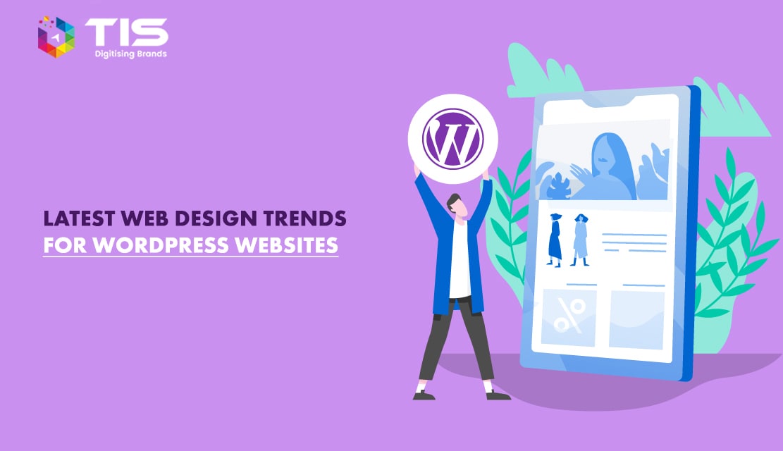
The upsurge in WordPress adoption frequency is evident from the perspective of greater focus on voluminous Online Impressions and higher Conversion Rates driven by Quality Content Management and Marketing which has taken the first seat in recent years. In 2026 also, we are likely to see the statistics soar higher, adding more and more numbers to the WordPress fan list and a massive crowd switching to WP web designs. Keeping in mind the release of WordPress’s latest version 6.0, I decided to shell out some time and put together a list of the latest WordPress web design trends and discuss the opinions with all of you. So without further adieu, let’s delve into the article that follows and take a look at What is Hot and What’s not in the WP world this year.
The way the internet is getting consumed via Smartphones is stirring at lightning speed with most internet users accessing the World Wide Web via Smartphones and Tablets. Therefore among all forecasted WordPress web design trends that will emit their spark in 2026, Responsive web design stood in the first place.
In response to the flexible approach towards using the internet, it makes sense that companies will continue developing their websites more streamlined and user-friendly for different platforms and that’s exactly what responsive web design does and will continue doing in next year as well.
Moreover, the introduction of new technologies offers more room for Responsive web design to move in the future because this is something that will be required always to view visually appealing websites on different screen sizes. Undoubtedly, this trend will persist to dominate the web design market owing to its flexibility and usefulness.
The hottest trend that has already established its footsteps in the WordPress world is Flat UIs. Not just in iPhone Mobile Operating System, it’s been a hot trend in Windows OS and Android OS as well. The reason is, that Flat User Interfaces carry your content elegantly and structure it beautifully by highlighting services and products in an ultra-modern way. For those who are not aware, let me explain a Flat UI in generic terms. Flat UIs are basically simple front-end designs that focus on fewer images, simple design elements, ease of use, and quick navigation rather than designs having big colourful gradients, rounded corners and drop shadows. Plus they fasten load times to a great extent as they don’t eat up much memory and enhance the usability experience as well.
Much has been said about responsive layouts in the past year and a large no. of people have switched to new themes also but not many of them have paid attention to the user experience. A responsive layout fascinates the visitors only when they are able to enslave everything with their fingers via touch or swipe design elements that promise to reciprocate well on all gadgets like smartphones, tablets, etc. Don’t just rush making your site responsive, read the tools and tricks to make your website device friendly and evaluate every WP web design with the User Experience you expect it to deliver.
Minimalistic Designs follow the “Less is more” ideology that focuses only on the core product while keeping everything simple. In more general terms, minimalistic design refers to incorporating only the critical elements and dropping the non-essential stuff from the web designs to give an ultimate online expression. Reducing the web design to only the most important elements along with the usage of aesthetic typography (rich text effects and font styles) enhances both the readability as well as usability of a website.
One pager website is one trend that became extremely popular amongst web design folks across the globe in 2020. But now in 2026, we are likely to see one pager clubbed with full-screen background sliders on the forefront that will give an amazing look to the web designs. However, this concept has already been implemented by many of the new websites but still, this trend is likely to remain popular in the next couple of months because of the impressive visual appeal teamed up with good navigation and endless scrolling driven by cool top menus.
Auto stacking grid-based layouts are web designs that resemble totally to the Pinterest site that you see on your desktops, wherein the content is divided into hundreds of grids that stack one after another automatically as you scroll down the page. Each of these grids is styled perfectly to accumulate both the text and graphics along with the small social sharing widgets and comments sections to give it an ultra-modern look and serve the Digital marketing purpose as well. Most of these web designs are clubbed with Infinite Scrolling to offer an exclusive user experience across a varied range of mobile phones, tablets, and other finger-friendly gadgets as well.
It is a known fact that words cannot do justice to pictures because a picture values hundreds of words alone. Therefore, this would be a new trend that would be a promising factor for web designers in 2026. Substantial background pictures would grow in importance and this is something that helps WordPress sites in bringing life to their designs. The use of high definition (HD) and clear background pictures will become a necessity for WordPress website owners to make their site more eye-catching and lively for the visitors and this ongoing trend of using HD quality background images will definitely persist in 2026 as well.
WordPress has already adopted full-size high definition background images as a part of its template design format and the Cars WordPress theme is an example of an HD quality background image WordPress template
The background images will not only help in enhancing user engagement on WordPress sites, but they can easily act as a central point in the overall design of the website for generating a particular atmosphere on the web page by assisting the communication of your brand messages with your target audiences.
Icon-based vertical menus are increasingly gaining much hype due to a broader focus on mobile-based navigations and better user experiences. Facebook Mobile well implements this trend in its Mobile Website by displaying a small icon on the topmost left which can be clicked easily on touch-based devices and all other pages can be quickly accessed. I have 3 pretty reasons to justify this trend.
Although flat designs have established their presence for some time now, they are regarded as Industry standard and hence, are one of the coolest web design trends that will continue to flourish in 2026 as well. This year might see many WordPress websites going flat and bidding farewell to other web design elements like patterns, gradients, shadows, and bubbles. It is the right time to embrace the simplicity and insightfulness of the flat designs that are somehow related to the most popular web design trend in demand and this is minimalism.
No matter whether the target audiences will access the websites via desktops, laptops, Smartphones, or tablets, flat designs are perfect for all devices by offering an intelligible page structure and clear layout. While Google has already called flat design, a material design due to its perfect combination of innovative technology with classic and good design principles, WordPress sites developed on flat design themes are definitely growing to catch impressive traffic and demand.
Gone are the days of Times New Roman and Ariel websites. The New Year will see the enhanced accessibility of reasonably priced and high-quality web fonts due to the rising demand for expressive, creative, and varied Typography trends within web design. The catalog of accessible options in Typography is set to expand in 2026 and font sizes will also play an important role in the selection of Typography in the imminent year.
Due to the rise in small screen usage and clean design styles, the bigger Typography will see a boost in their usage to avoid small screen users peeking at their mobile phones in frustration.
Scrolling will continue its dominance in the near future due to its flexibility and functionality in mobile phone environments. By offering a much more pleasurable mobile experience to mobile phone users with a tendency to be more amicable and portable, scrolling will take over clicking which has been less supported by them in 2026. Due to the increasing popularity of scrolling as a demanding web design trend, there are various WordPress one-page sites with scrolling feature integrated over the internet with more additions to come in the imminent year.
It will enhance the load time of the web pages, which is important for a website’s success. It means once again, the one-page designed WordPress site with scrolling feature will get victory in the website was challenging the standard multi-page layout tab in the year 2026 by offering more user-friendly and intuitive websites.
Apparently, Ghosts buttons are another web design trends that will become popular together with the Background images for WordPress websites.
With their smart, stylish, subtle, and minimalistic design, these buttons will add the perfect touch of modernity and elegance to the website’s design. Other benefits that will help in increasing their popularity as the demanding web design trend for WordPress websites are:
All these benefits will contribute equally to continuing the demand and recognition of Ghost buttons.
Headers that include Logos along with Navigation Menus right on the top, are indeed the crucial part of any website from the SEO lens since easy navigation is one thing that maximizes inbound traffic and easily allows the visitors to look through web pages other than the Homepage. But sadly, headers are left behind while a visitor scrolls down the page to see the stuff residing “below the fold”. The biggest loss here happens on conversions since it irritates the customers to again scroll to the top to go to hyperlinks to gain access to other useful web pages. So the simplest solution to this problem is creating a supercool fixed header that sticks to the top of the screen even while you are scrolling downwards endlessly. To achieve a fixed header, you can use a free sticky header plugin that can be downloaded at Thematosoup.com or you can opt for premium WordPress themes that come with fixed headers.
Retina displays showcase extremely high-quality pixel displays that are best utilized by our one and only Trendsetter Apple in all its popular devices from iPhones and iPads to Macbooks and iPods. In web designing, Retina Display refers to designing something that presents crystal clear images and caters to high-resolution screens and pixel-perfect displays as well. As newer high-resolution devices come into the picture, we will see fuzzy and blurred images getting replaced by clearer, sharper, and better-scaled graphics.
Large introductory content on website homepages by left-aligning the header vertically is one of the newest web design trends that is quickly gaining momentum. Creativity at its best can be seen in these designs along with the manipulated imagery that puts forth all your content right into the middle in an amazing way.
To come up with something unique that is liked by the audience, more and more designers are now experimenting with interactive designs that take a different approach to lure the audience. Conveying the whole of the message through graphic media is becoming popular amongst those who are playing with simple and intricate designs. These web designs explain the services and products through story-telling animations that speak what the words can’t do in a more memorable way to leave a long-lasting effect on visitors. Many web designers are basing their Homepage on these types of illustrative Info graphics coupled with minimal text.
Yes, you got that right, adopting good and flushing out the bad is also a part of a trend. To make your online presence 100% successful, see what web design practices, experienced web designers and developers are dumping without any second thought into the never-to-be-recycled bin.
In an endeavour to make all of you familiar with the top trends that are likely to populate the Web Design arena this year, I believe I have talked about much useful stuff. If you or your friends also plan to have a WordPress website and would like to spruce it up with a new makeover, contact TIS to get an affordable quote customized to your business.
 C - 81C, Sector - 8, Noida 201301, India
 info@tisindia.com
 (+91) 9811747579
1025 Beamon Drive, Franklin 37064 Tennessee, USA
info@tisindia.com
+1 424 283 4688
Sveavagen 34 111 34 Stockholm, Sweden
info@tisindia.com
A-10, Sahastradhara Rd, Doon IT Park, Dehradun, Uttarakhand
info@tisindia.com
(+91) 9811747579
(+91) 9811747579
1025 Beamon Drive, Franklin 37064 Tennessee, USA
info@tisindia.com
+1 424 283 4688
Sveavagen 34 111 34 Stockholm, Sweden
info@tisindia.com
A-10, Sahastradhara Rd, Doon IT Park, Dehradun, Uttarakhand
info@tisindia.com
(+91) 9811747579
© 2026 TIS. All rights reserved.